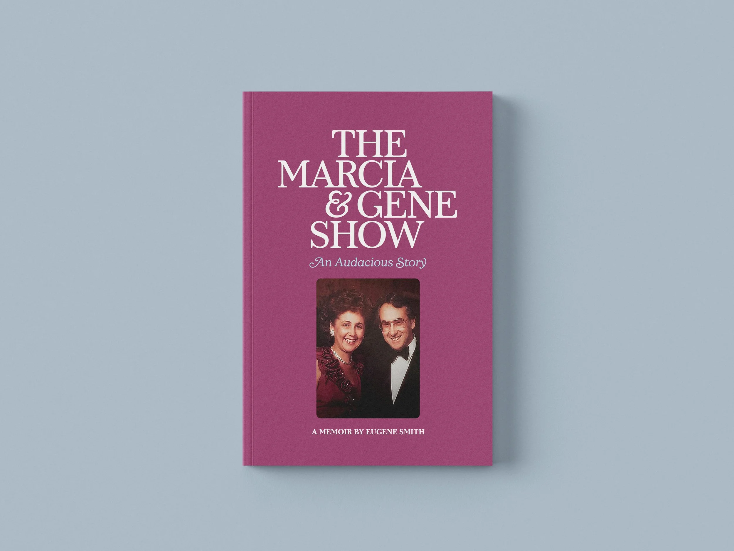
The Marcia & Gene Show: 1970s Television Aesthetics for a Multigenerational Family Memoir
The Challenge
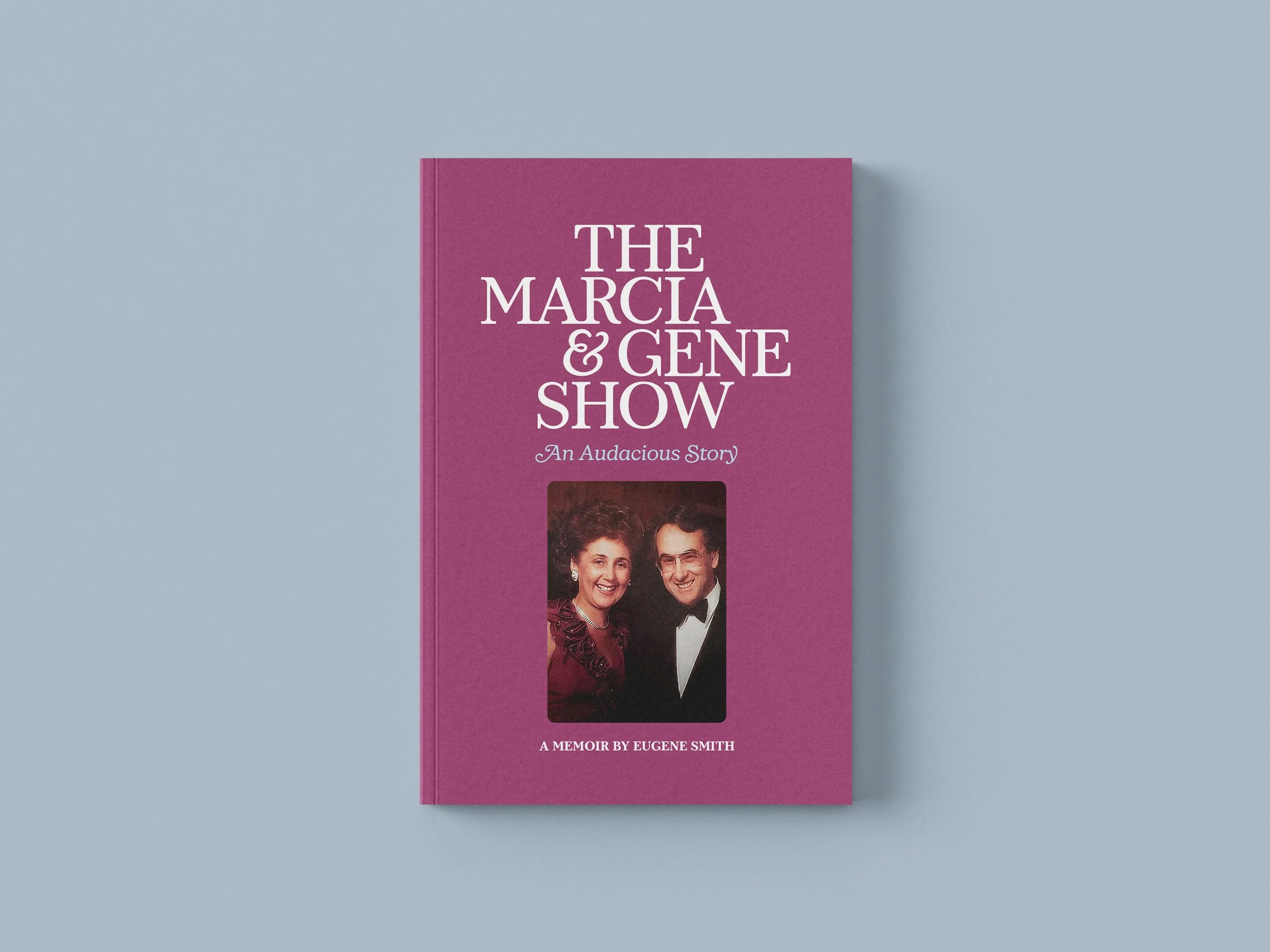
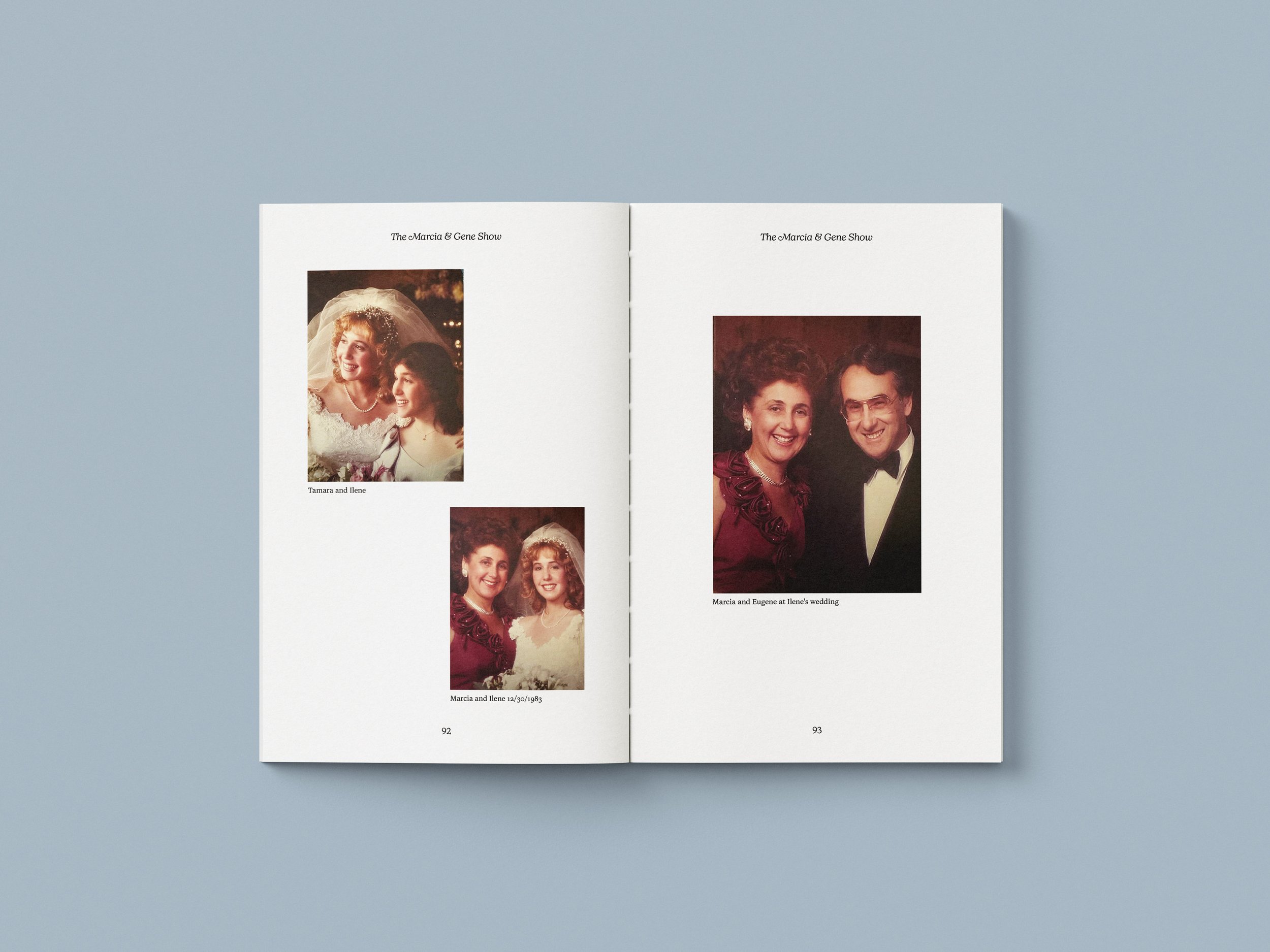
Following the passing of his wife Marcia in late 2020, Eugene Smith penned a sprawling, multigenerational memoir capturing their audacious, lifelong partnership alongside decades of family history. The design challenge was to translate this deeply personal text into a published book that rejected traditional, somber mourning tropes. Instead, the author favored an exuberant, uplifting narrative tone that celebrated a vibrant life shared together.
Strategy & Inspiration
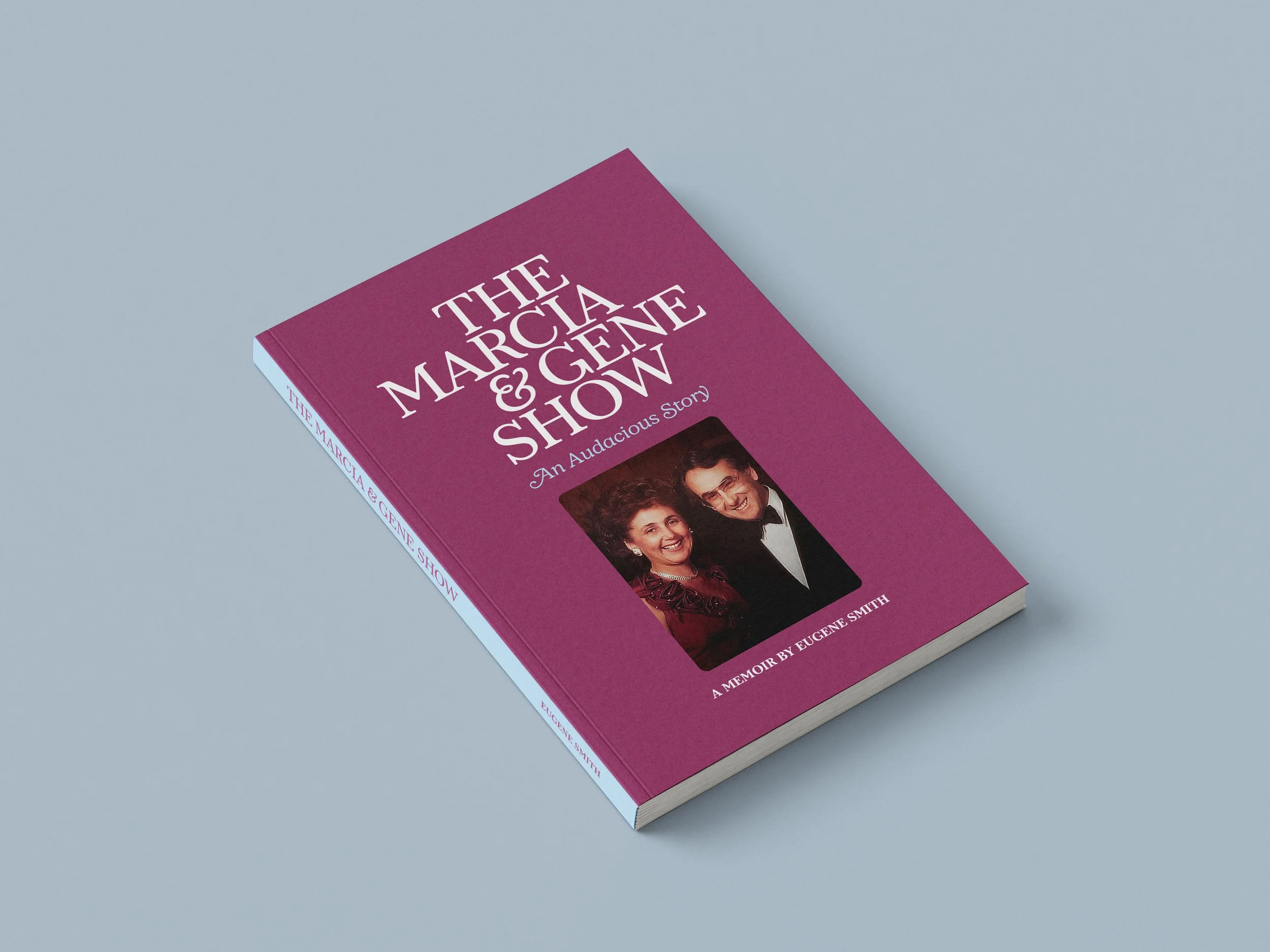
The creative direction takes its visual cues directly from the affectionate nickname given to the couple by their children: The Marcia & Gene Show. To honor the era the family spent gathered around the television in the 1970s, the design framework borrows graphic and typographic sensibilities from iconic sitcom title sequences of the period, particularly All in the Family.
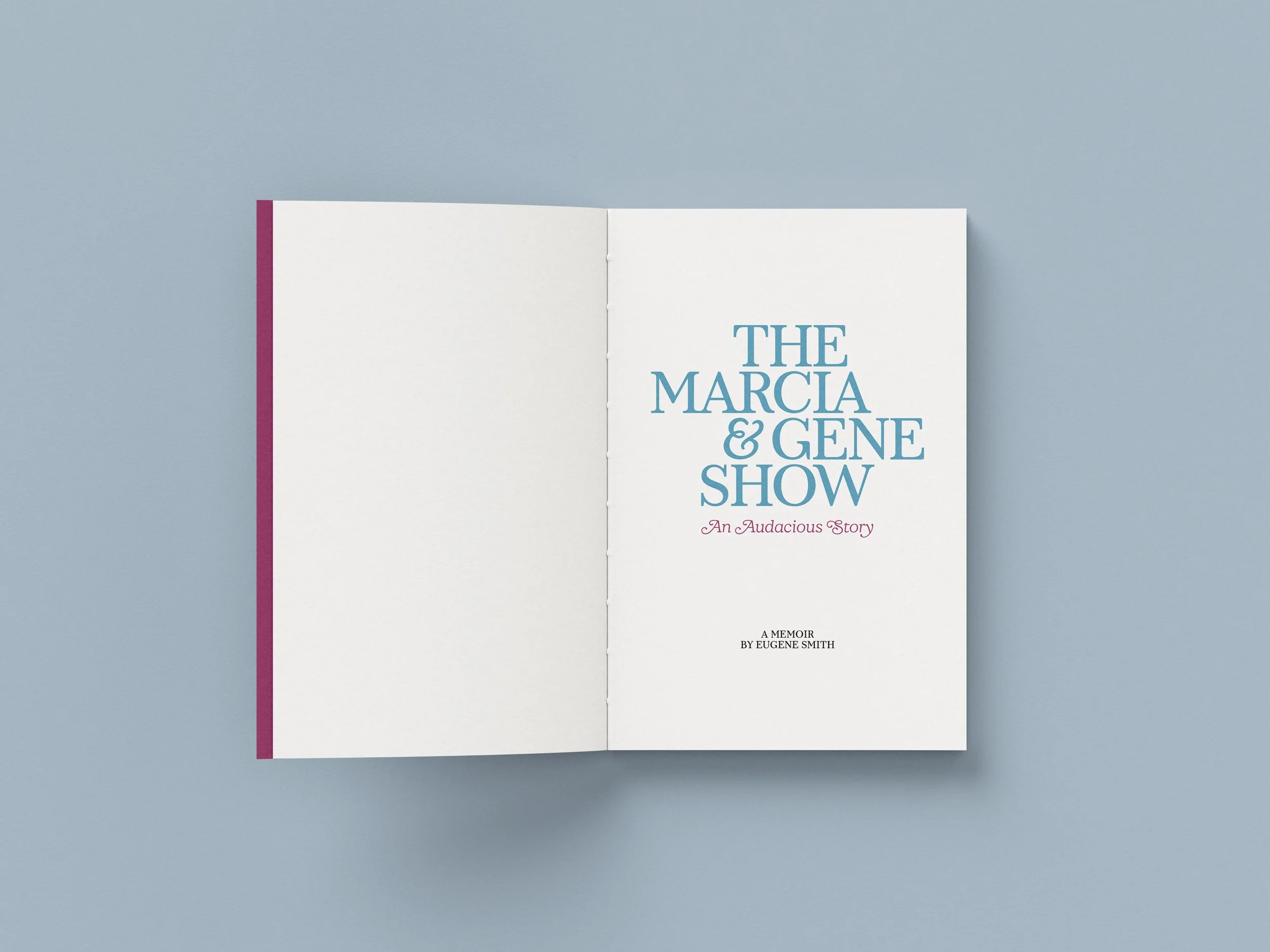
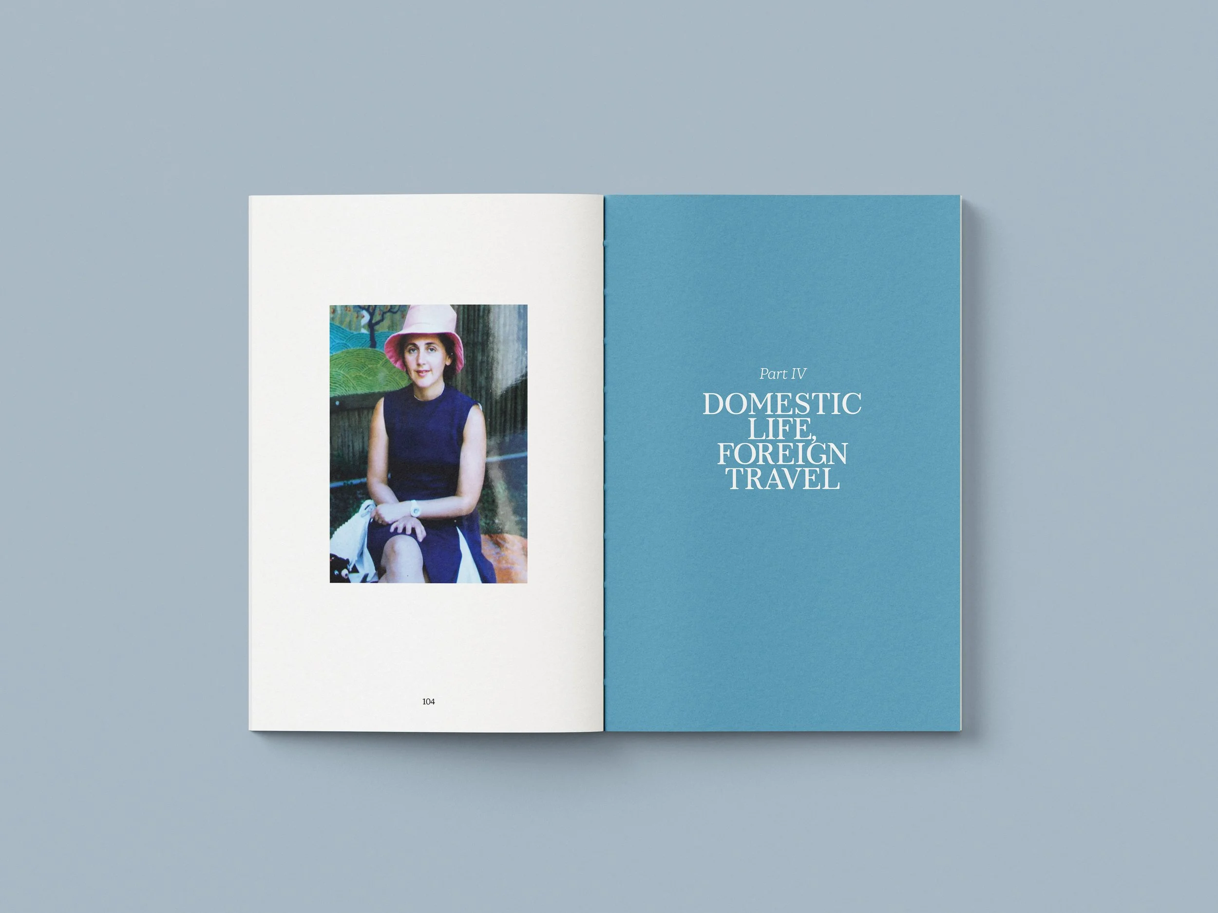
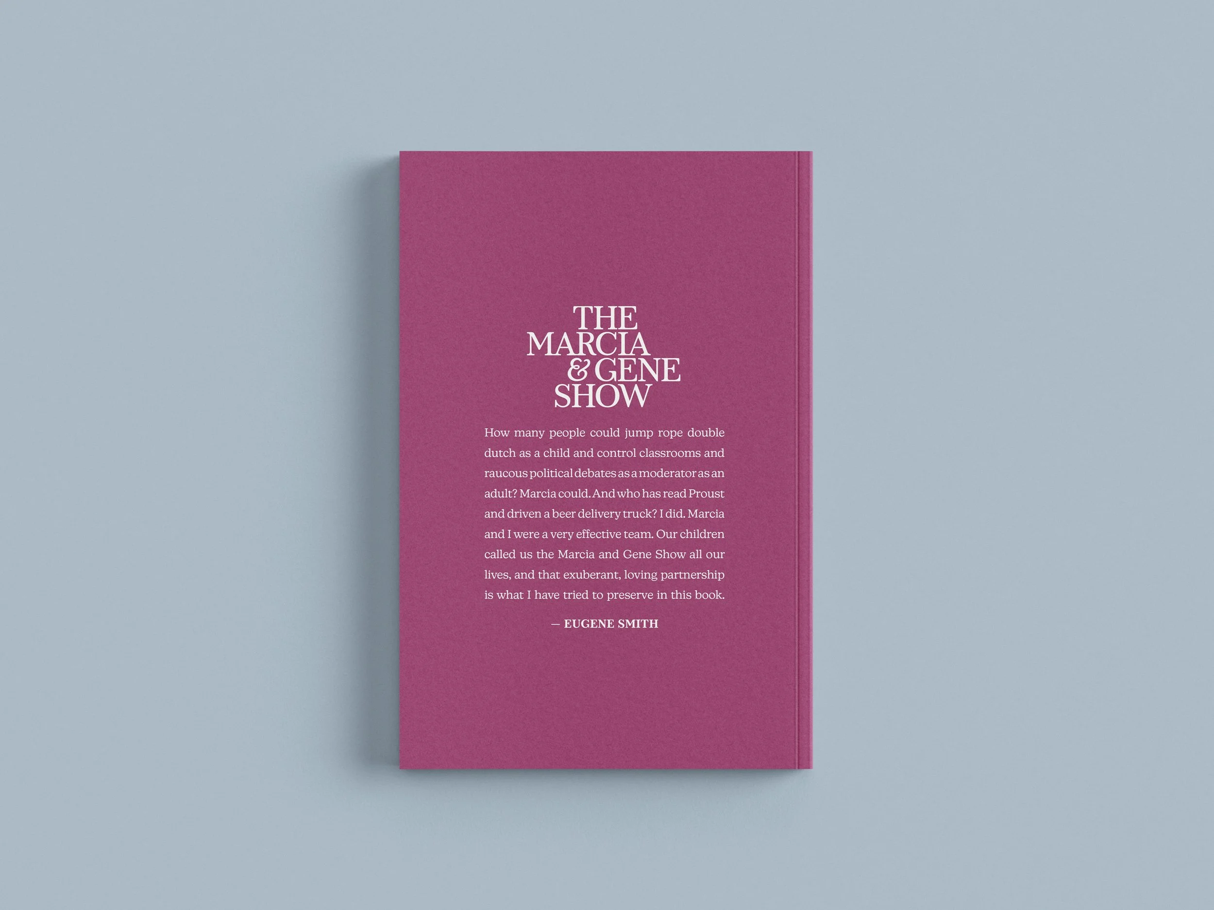
The color story serves as an emotional anchor for the project. By leading with a crisp sky blue—Marcia’s favorite color—and pairing it with an energetic fuchsia accent, the book achieves a nostalgic yet contemporary aesthetic that feels inherently celebratory.
Typography & Editorial Design
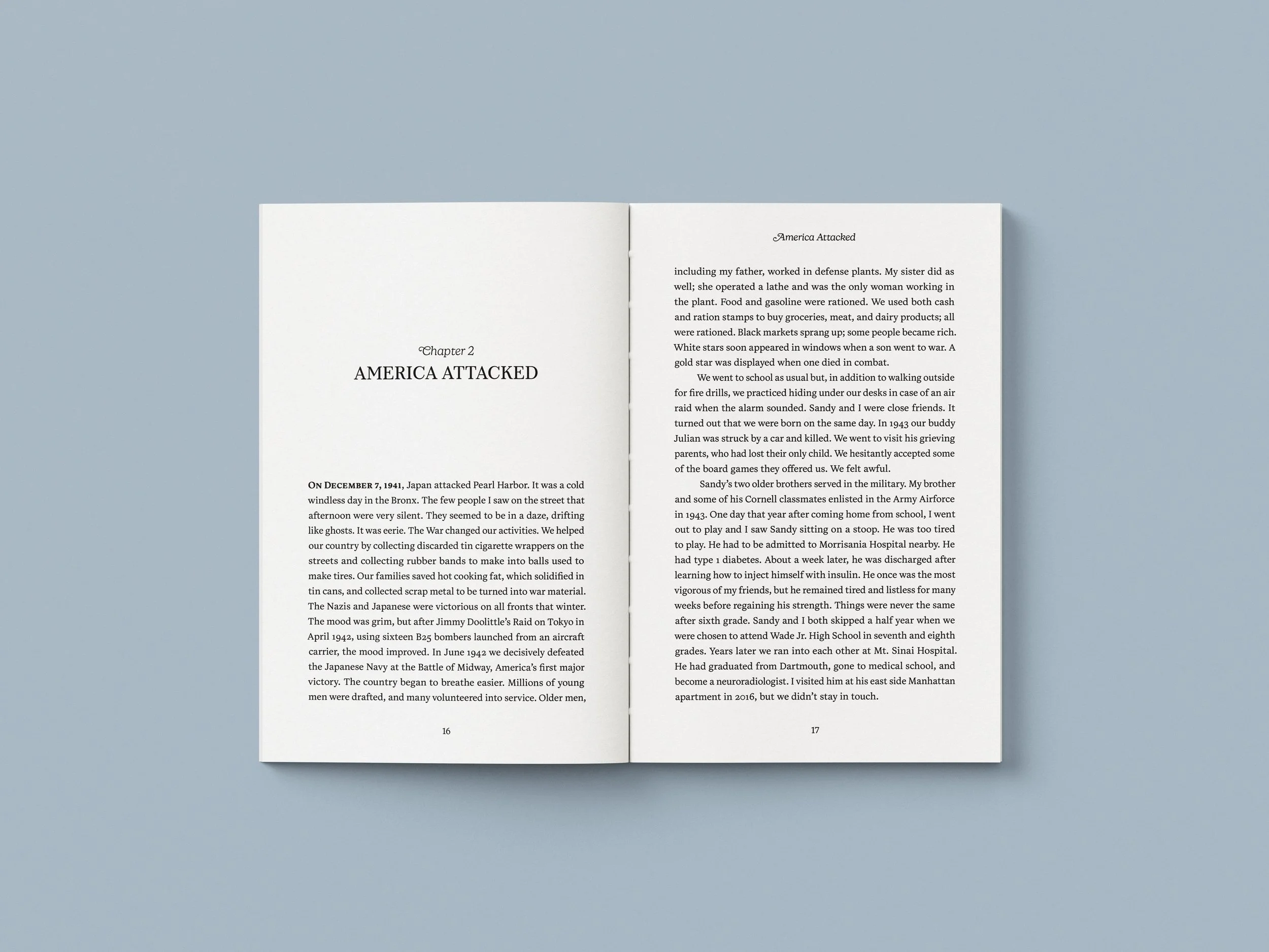
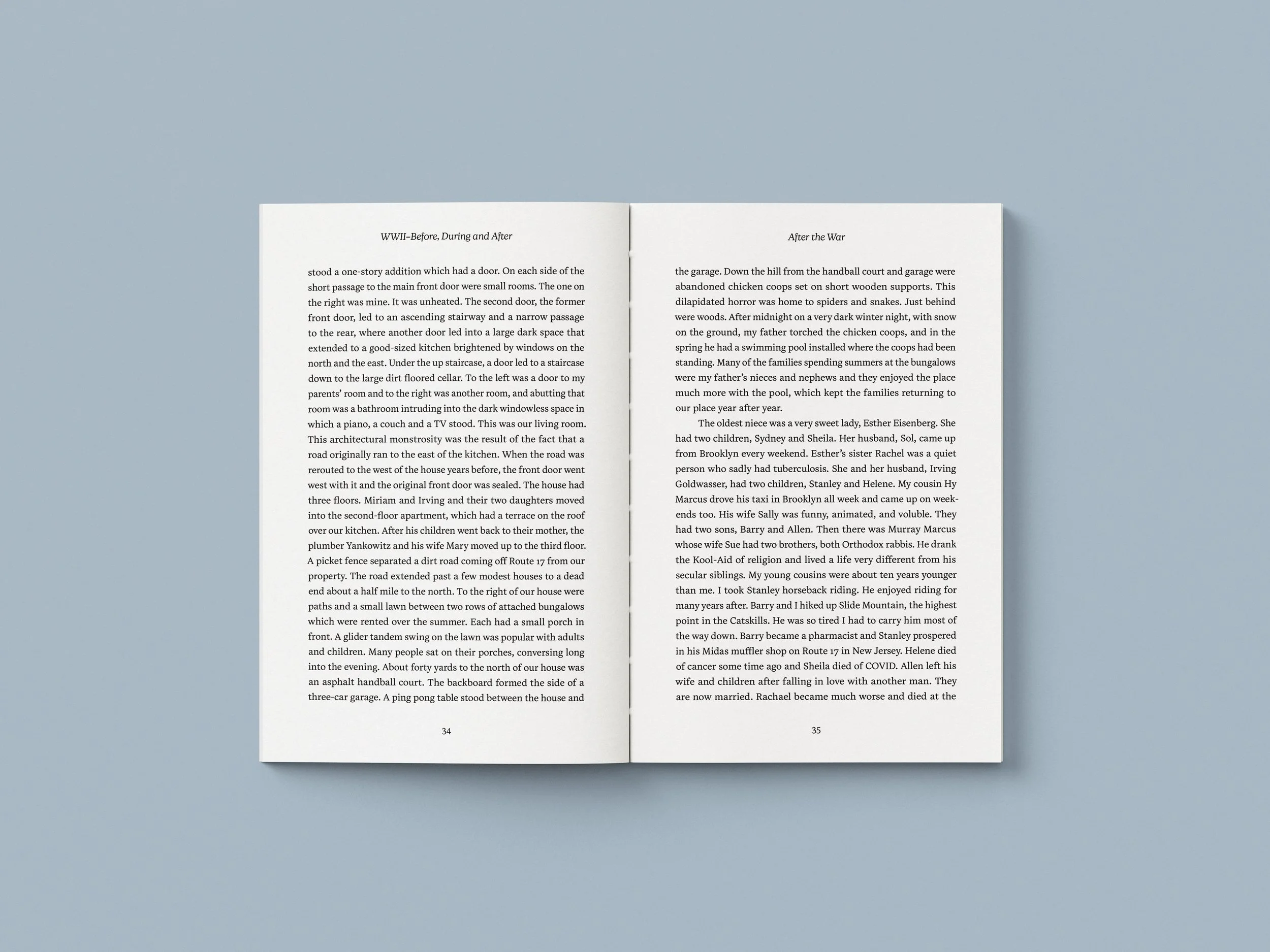
The typographic ecosystem acts as a direct homage to the narrative's central figure. For the book cover and the interior chapter titles, a pair of highly expressive display faces were selected: "Marcia," a typeface sharing her namesake, and "New Kansas Swash," which brings an authentic, curvilinear 1970s retro flair to the editorial layout.
To balance these bold headers, the long-form narrative body text is set in Tiffin Latin VF. This warm, fluid, and feminine text face ensures optimal readability across the multi-chapter family chronicle while maintaining the inviting, human-centric tone of the memoir.